Posts

Showing posts with the label Album Cover

Digipak back cover research

Image
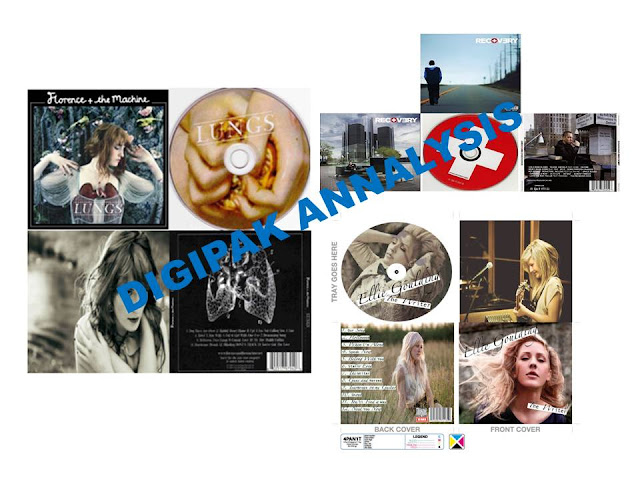
These are templates I could use as inspiration- I have decided i do not want to include the title of my album or my artist's name like these albums (besides Eminem). I can use a layout and input material as inspiration for my legal writing to include in my product. I still (as I have in my draft) want to include the timings in my track listing just as Space Trax has for their track listings. I do like the use of the dividing live for the Arctic Monkeys album- I may give this a go. 
Digipak feedpack

Image
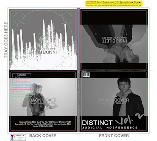
EBI TARGETS- I need more text on the spine of my CD. Such as the record label, catalog number, album title and artist name. The back cover must have track listing, record label, legal wording and barcode. All my panels need to abide by the rules of third, I need to apply the rule of thirds to each panel. My margin alignment must be consistent. CD art must be included and and CD Tray art must be included. No more than three fonts on entire CD packaging : legal font must be clear- look at inspiration for what needs to be included in legal writing. Consider inclusions of web addresses Avoid album name and any other panel other than the cover and the spice

Experimentation - Comparing my Inspiration

Image
 Here I experimented to try and mimic the style of one artist who has inspired me. I used photo shop and layered photos I had taken of my artist to achieve this effect. I also edited the brightness and the opacity of the images. I had discovered this when I was visiting the site Consequence of Sound. I have decided I would like to try and attempt this again so I am going to take some more photos and try this affect again. 

Comparing my Inspiration

Image
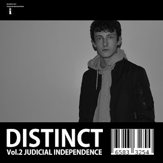
I have tried to correspond my draft cover to my inspiration Marisa Nadler's cover for Strangers. I have done this by including the borders and the artist information. I have differed from the inspiration through applying two borders and a bar code. The use of the black and white is a pure coincidence as I had planned to use black an white before but I believe that the borders could only work with a black an white colour scheme, in my opinion, for my artist. 

Front Cover (DRAFT) for Vol.2 Judicial Independence by Distinct PROGRESSION

Image

Front Cover (DRAFT) for Vol.2 Judicial Independence by Distinct

Image

Digipak Analysis : Eminem

Image

Digipak Analysis- Ellie Goulding

Image

Digipak Analysis: Florence and the Machine

Image

Jeff Jank Inspiration

Image
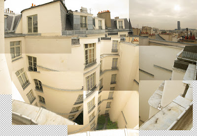
Whilst searching through Jeff Jank's CD cover site I came across some interesting photography which had been collage together to an imperfect image. I believe I would like to try this method of taking images of a wide area and collage them together to create some form of image. 

Complex CD Covers in my Genre

Image
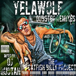
Styles like this I believe would be too extreme , not only to accomplish, but for my artist. As we are aiming for him to be a new, niche and not extremely mainstream artist in our genre I fear it would be too much to design and release a cover along the lines of these because they would not fit with the video, the concept and the style. These albums stereo typically look as though they are for songs which are about the good rapping, music artist lifestyle and therefore entail things about drugs, money and sex where as the thought behind our song is very heartfelt and sensitive whereas this image would not convey this feeling or emotion. 

Music Sites and How They Have Helped Me - Consequence of Sound

Image
Consequence of Sound- I viewed this site and explored all the categories such as film, TV and Music and viewed some of the latest articles on the Music category. I discovered a new article concerning the group METZ which involved the release of their new single and this image.  This image really sparked my curiosity with the visual aspect as it looks like the relay and layering of a multiple amount of images. which were taken at the same time, place and with the same people only having the subjects move, not enough so that the image is unreadable but enough to convey a sense of artistic convention. I have decided I would like to experiment with this effect and if it works well I wish to apply it to my album/ CD cover.